
UPenn Professor Jeffrey Morris tries to discredit me and fails...badly, very badly
He uses a hand-waving argument to try to discredit me. Just one tiny little problem: the actual underlying data shows he's wrong. That's why he never references any actual data.

Executive summary
UPenn biostats Professor Jeffrey Morris claims he’s a truth seeker.
But he’s not.
He’s a narrative pusher who has never been able to find a single shred of evidence that the vaccines MIGHT be killing people.
“Impossible events” like at Apple Valley Village don’t phase him at all. He just writes these off as anecdotes even though the chance of that event happening by “chance” is remote.
He’s at it again in his most recent attacks on a recent post I made.
He ignores all the actual US government data in plain sight (the CMS Nursing Home Data), and simply makes a hand-waving argument that short-term care facilities have a higher death rate than other facilities because these patients are more fragile. He never cites any actual DATA to back up his claim.
There is a reason for this. The DATA shows he’s avoiding seeking the truth, exactly the opposite of what he claims.
Anyone, including Professor Morris, can download the data showing he’s wrong. In this post, I’m going to show what happens when Morris’ hand-waving takedown is fact checked with the actual data.
Furthermore, one of the most damaging anecdotes is Apple Valley Village and Morris just completely side-steps that one. There is no way he can attack that data. So he hopes that you’ll take his word that there is nothing to see here. Wrong.
His 3 posts
He also made two Twitter posts with the same argument as above:
and this one:

Professor Morris never cites any actual DATA from the CMS Nursing Home database to justify his attacks.
Instead he uses a hand-waving argument with no evidentiary basis to back up the claim. We have to believe his “logic;” he’s not showing us any actual numbers.
There is a reason for that: the data shows he’s wrong. Not just a little wrong. He’s misleading people big time.
And according to The Real Truther, Jeffrey Morris is the very best there is, a man who always checks his facts and “who is IMO the smartest guy on Twitter when it comes to the COVID vaccine.”
Similarly, this guy in the mask who claims to be a debunker (even though he admits he doesn’t understand what the papers say) and who is followed by anti-vax debunker Susan Oliver had this to say:


Here he admits he doesn’t evaluate data. He’s just a mouthpiece of people he agrees with:

A message to Professor Morris
If you are going to attack my numbers, show me your numbers, not simplistic arguments that you are using to gaslight people.
What the data actually says
Morris never disputed the following:
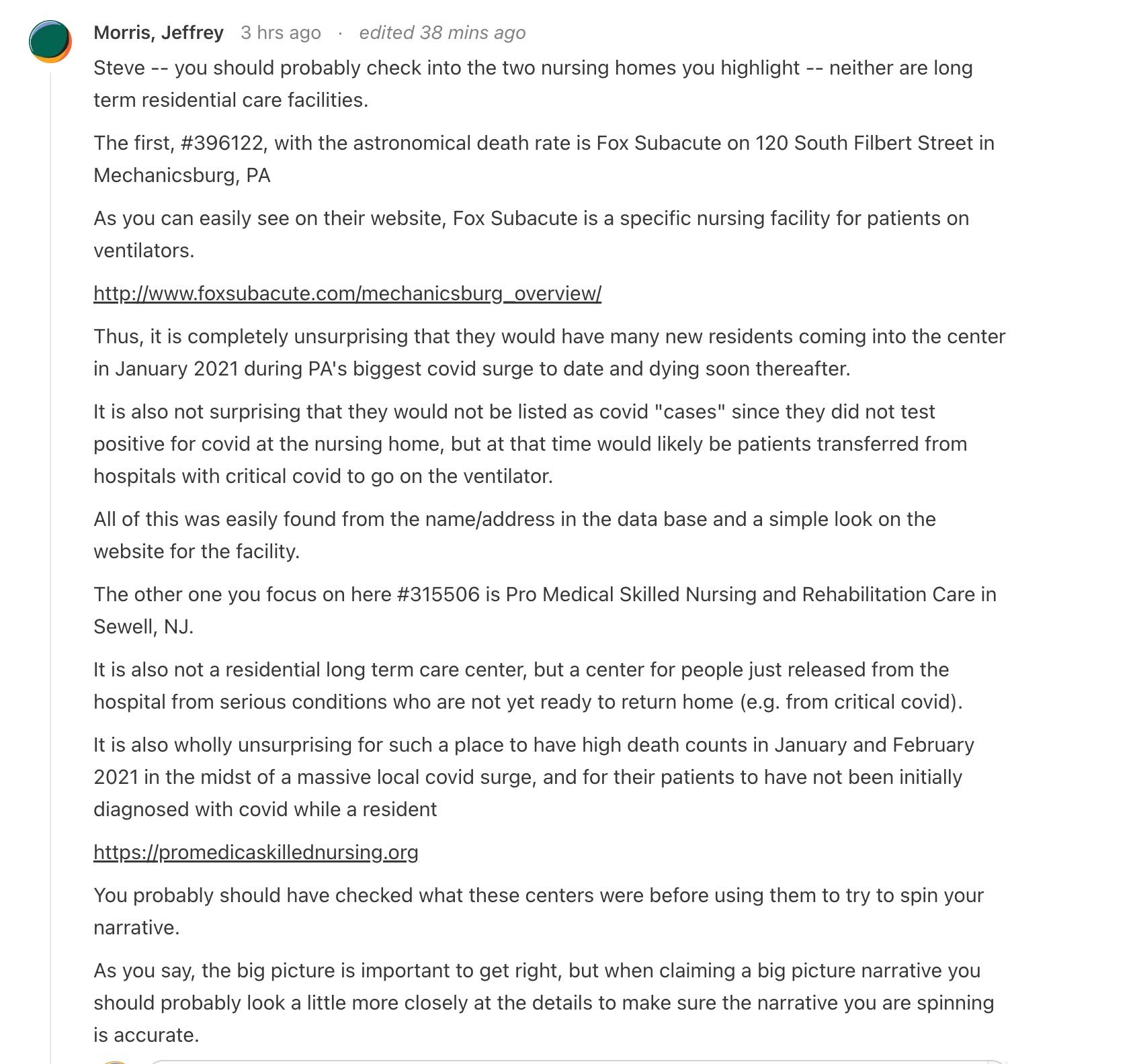
315506 (Pro Medica in Sewell, NJ): I wrote about this first here, and then here, after I was attacked. Over a 2 month period (from the start of the year to the week ending 3/7/21), 153 residents died in a facility that had an average occupancy of less than 100 beds over that 2 month period. This is a 77% average death rate per month based on the average occupancy of the facility over the period.
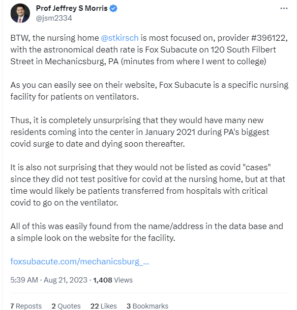
396122 (Fox subacute): There were 131 deaths in the first 3 months of 2021which is an 83% monthly death rate relative to the average occupancy of the facility. In other words, on average, in each month there were 43 deaths in a facility occupancy of 48. For more detail see this section.
Losing 77% to 83% of your average occupancy in a month is hugely problematic. The average nursing home in the US has around a 40% turnover per year which is just 3.3% per month. So those rates are “off-the-charts.” They are over 23X higher than the average nursing home.
Morris argues two things:
These are not regular nursing home facilities so their death rates are higher due to the higher risk type of patients they get
There was a COVID surge in January and Feb. which explains the higher deaths.
He claims that the combination of the two explains the data that was observed. Case closed. No need to even look at the data.
He offers absolutely no NUMBERS to back up his claim. Just hand waving arguments with NO NUMBERS.
Essentially, he is saying, “There is nothing to see here folks; this is perfectly normal.”
Is he right? What do the numbers actually look like?
The data can be downloaded here. So you don’t have to trust me at all.
First let’s look at the COVID surge from Our World in Data:
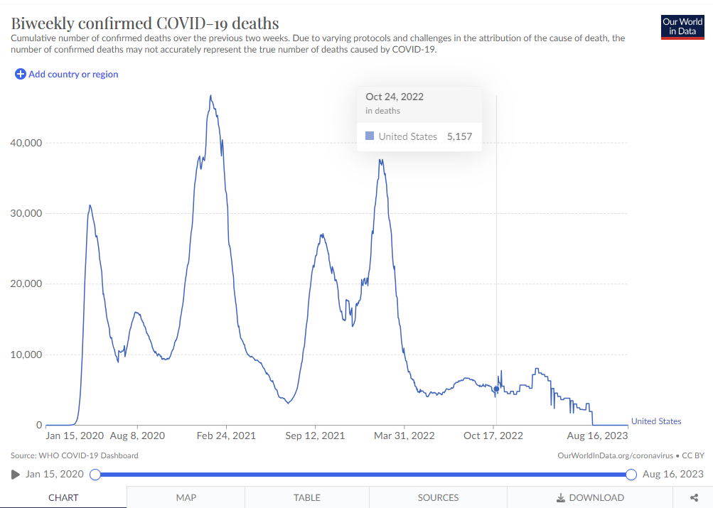
The first peak is Jan 23, 2021 at 45,000 people. This reflects the number dead over the previous 2 weeks. So the actual peak was somewhere around Jan 16, i.e., mid-January. It dropped to half that amount of deaths at Dec 1, 2020 and March 7, 2021.
So in general, we’d expect December = February numbers, but that Jan will be higher since it is the COVID and thus ACM death peak.
Also, August should be about 1/3 of the Jan peak.
So if we are within that zone of dates, our COVID death rate (not the all-cause death rate) should vary by less than a factor of two.
Let’s now dig into the stats for these facilities in December and February. The stats for Feb and Dec should be roughly comparable since the curve is symmetrical, and the numbers should be highest in Jan (definitely less than a factor of 2X from the peak in Jan since rates were going up and down in those months). If anything, Feb should be lower than the deaths in December because the jabs are SUPPOSED to reduce death from COVID by 3X which is what the CDC told us. But since most of the deaths in the chart are the elderly who had been jabbed, it’s possible that the death rate in Feb could all be due to the vaccine and if it weren’t for the vaccine, the deaths would be even higher.
Regardless, it’s clear that the all-cause death rate per average occupancy should be comparable in Dec and Feb, and highest in mid-Jan.
Let’s see what happened at our two facilities, shall we? This is going to be fun!
315506: Pro Medica in Gloucester County, NJ
Let’s look at the COVID death rates first in that county. The numbers are listed in the figure caption below.
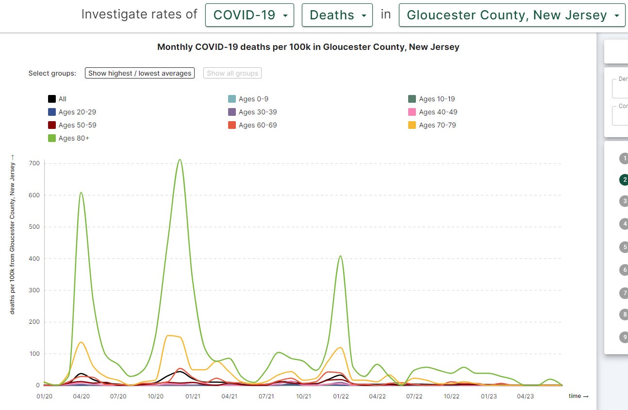
Look at the COVID and all-cause mortality deaths. Both should peak in December and go down. But they don’t.
They peak in February when the COVID death rates should have gone lower by 6.2X vs. the Dec peak.
Instead of going lower, the ACM climbed by 4X.
How does Professor Morris explain this? He doesn’t. He never looked at the data. He just applied a hand-waving argument without looking at the data and expected people to believe him. That’s how science is done today: expert opinion with no basis in the actual data.
Look at COVID deaths vs. December. Those should have gone down by 6.2X. But they went up by 1.7X. That’s a staggering difference.
But finally, and most importantly, look at the entire ACM column. This facility went from an average of few ACM deaths per month before the vaccine to 83 deaths in February! That’s the problem.
What caused the 83 deaths in a facility with just a few deaths? It wasn’t COVID as we see from the chart. And why did COVID deaths peak in February?
And, if you take away the COVID deaths in Feb, you still cannot explain the huge rise in non-COVID deaths in Feb, 2021. Normally there are 0 to 1 non-COVID deaths a month in that facility. In February, there were 52 non-COVID deaths.
How do you explain that if it wasn’t the vaccine? What killed these people?
Professor Morris doesn’t even want you to look at that. He doesn’t care enough to even look at the data. He dismisses it out of hand. Because the narrative must be right.
 - YouTube")
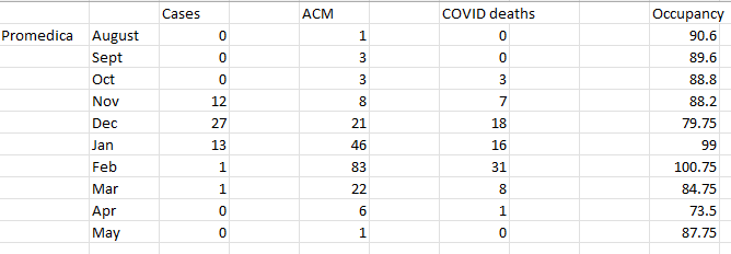
396122 Fox subacute in Cumberland County, PA
Let’s look at the COVID death rates first:
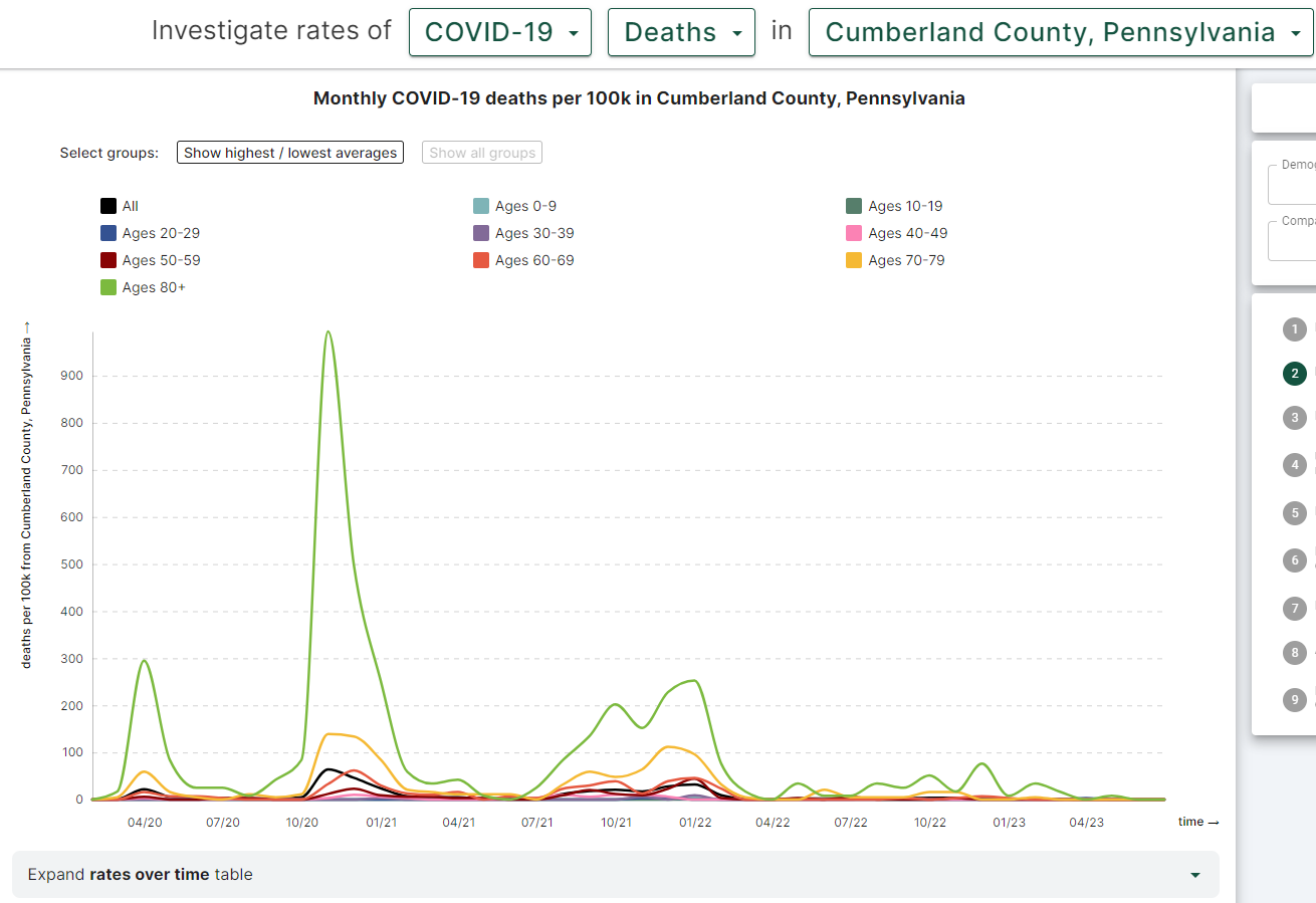

LOOK AT THE ACM NUMBERS! THEY ARE STUNNING.
Jeffrey Morris says that there is nothing to see here and we should just move along.
This site didn’t track COVID numbers.
But look at the ACM column. It is stunning!
The facility has an average of 1.2 deaths per month BEFORE the vaccine rollout.
Then the vaccines roll out and bam!
1.2 deaths per month to 66 deaths in a month!
Was it COVID? Nope. COVID peaked in NOVEMBER. By February, the COVID deaths went down by almost a factor of 20X. So what caused the ACM to start to rise right after the vaccines rolled out? Gee, I wonder.
Professor Morris says nothing to see here folks. Move along.
Going from 1.2 deaths/mo to 66 deaths in a month?!?! That’s nothing to see?
What do you think?
Do you think there is nothing to see here?
No, a 55X increase is a big deal
968 VOTES · 2 DAYS REMAINING
You can download my spreadsheet and see the data for yourself
My spreadsheet analyzing the two sites. This is the fastest way to verify the numbers listed in this article.
Summary
Something is causing massive increases in COVID deaths and all-cause mortality deaths. It started happening right after the jabs were given to the elderly. And it seems to only be affecting vaccinated people for some reason. All these people who die or have heart attacks… there is NEVER a mention that they are unvaccinated.
If Professor Morris is confident it isn’t the vaccine that is causing these huge increases in both COVID and all-cause deaths, he should simply explain these numbers with a more plausible explanation that fits all the dataand explain what happened at Apple Valley Village.
But he can’t do that. So his only recourse is to convince you not to look at the data and believe him when he says there is nothing to see here.
There is a reason that the CDC has never cited the CMS Nursing Home data as proof that the COVID vaccines work: it is because it proves the opposite, that the vaccines are a disaster.
The CDC and Professor Morris would prefer it if you do not look at the data. Just always trust the authorities, no matter how bad the data looks.


No comments:
Post a Comment